Reviving the Medicare Plan Search and Enroll Experience
My role
- UX/UI Design
- Accessibility Specialist
The Challenge
The process of shopping for, and enrolling in, a Medicare plan is an intimidating journey due to the weight of the beneficiary's decision which affects their health and drug coverage — but also due to the incredible amount of info about options and services that flood Medicare beneficiaries every year.
Compounding this overwhelming time for millions of Americans was the fact that the legacy app used to sign up for a Medicare plan was cognitively overwhelming, not intuitive, and not mobile-friendly.
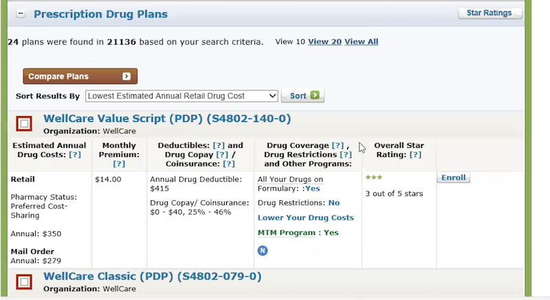
A screenshot of the legacy tool's Plan Results page
From our user surveys, usability testing, and meeting with customer service representatives some of the foundational issues we needed to resolve were:
- Build the application to be responsive with all sizes of devices and types of users in mind
- Reduce cognitive load and present information to the user only as they need it
- Prioritize site accessibility, performance, and security. (Three things designers tend to forget about but improve UX dramatically.)
Working iteratively our approach was: What can we deliver as an MVP to provide the most impact in the shortest amount of time? Then we would continue to resurface the user pain points and business objectives to ensure we were staying aligned.
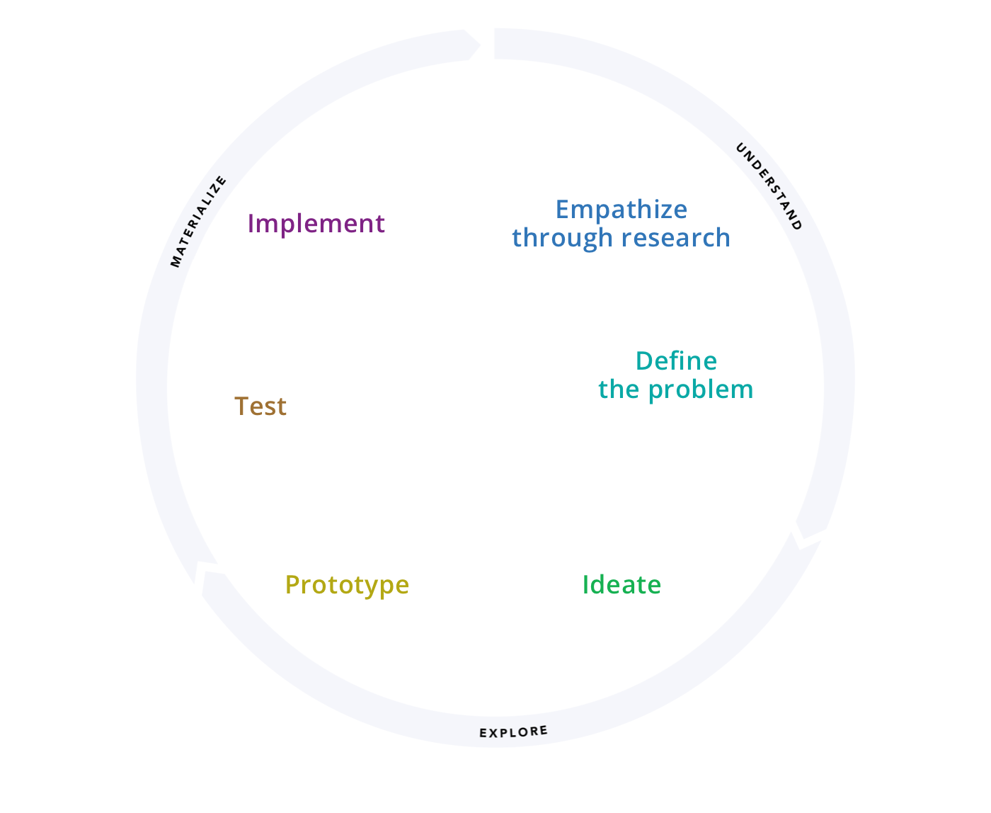
Six stages of the design process: Empathize, Define, Ideate, Prototype, Test, Implement.
The Work
Gathering insight from Medicare beneficiaries, customer service reps, and state-sponsored support agencies we were awash with data into how people used, signed up for, and accessed their Medicare services. Through our usability sessions identified key pain points that would provide the highest impact to the users of the application.
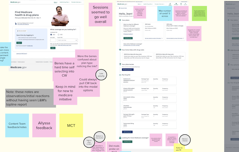
A screenshot from a Mural board at a collaborative workshop session with stakeholders. High fidelity mockups and sticky notes are prevalent.
Our cross-functional team organized workshops with diverse stakeholders around balancing the user improvements, policy needs, and technical feasibility. A real key to this step of the process was listening to call center representatives. These "boots on the ground" workers were able to provide us with a wealth of information that they hear every day from users who call with a myriad of questions and issues while trying to sign up for a plan.
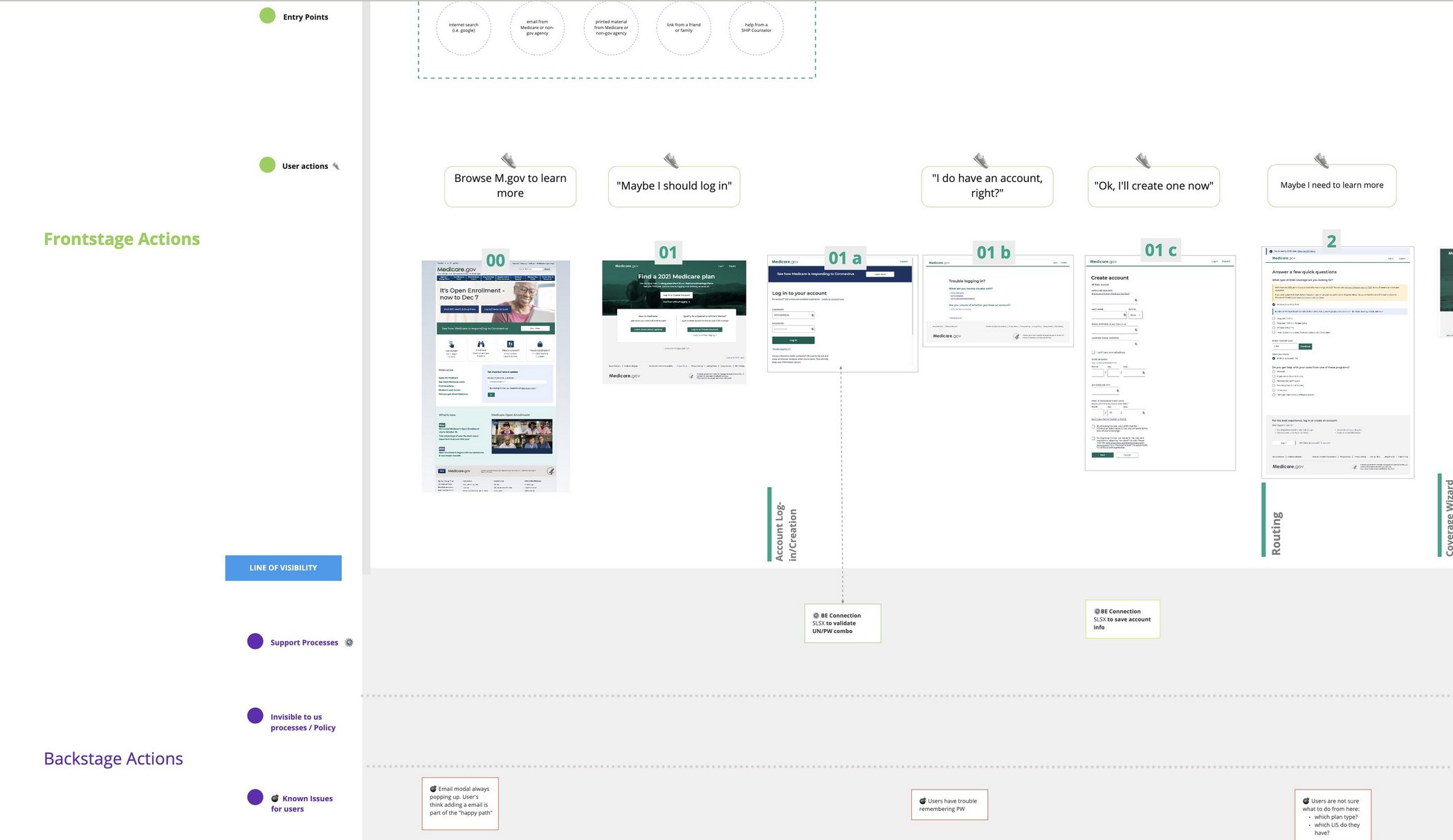
A service map I created to better understand the touchpoints with our user base. This continued to be revised with the more we learned.
Our core features of focus
- Drilling down to the drug and pharmacy search experience From research, it was clear that drug costs are one of the most stressful and most important decision points for a beneficiary. The pharmaceutical landscape is filled with complexity and is constantly evolving due to policy changes, how a plan and pharmacy covers a drug, what tier that drug is on, and how the drug moves through the Medicare coverage phases. By reducing friction at this stage in the user flow we could ease the tension in the experience and reduce time to complete the action.
- Reducing cognitive load during the plan search and enrollment experience Provide just the right amount of information at the right time within the decision making process to allow users to quickly find what they need and make a decision. Some users don't want to log in at first so allow them to find
The Outcome
Shown below is the MVP version we delivered in time for Open Enrollment. Further iterations based on usability testing and collaborations with client stakeholders allowed the work to evolve, as it should, but this work allowed for a solid foundation to serve to the American people.
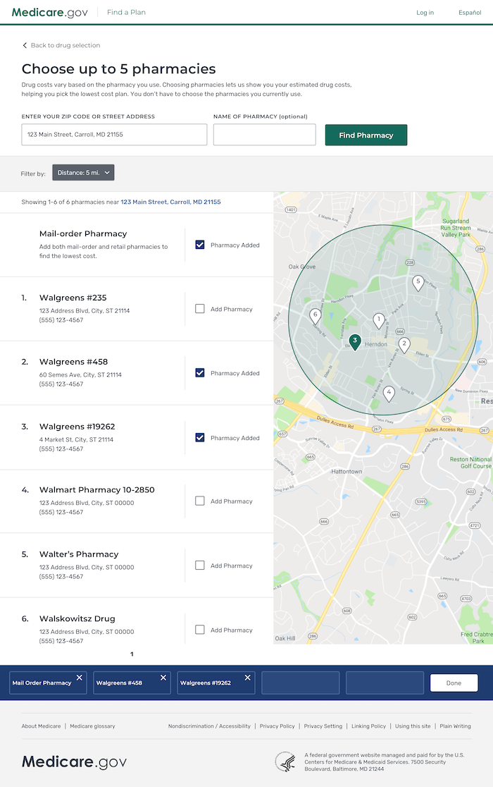
Pharmacy search redesign
Repeatedly in user testing our users noted that the redesign was a huge improvement in their experience and now they would gladly use medicare.gov for their healthcare search.
Key design points of pharmacy search redesign
- Allow users to filter results, reducing cognitive load and making it easier to find relevant info
- Allow users to "add pharmacies" to their logged-in experience so they could receive more accurate drug pricing
- Cleaner use of hierarchy, typography, and white space to allow the content to breathe and reduce visual and cognitive load
- Display a map view for contextual setting and alternative method of viewing the data
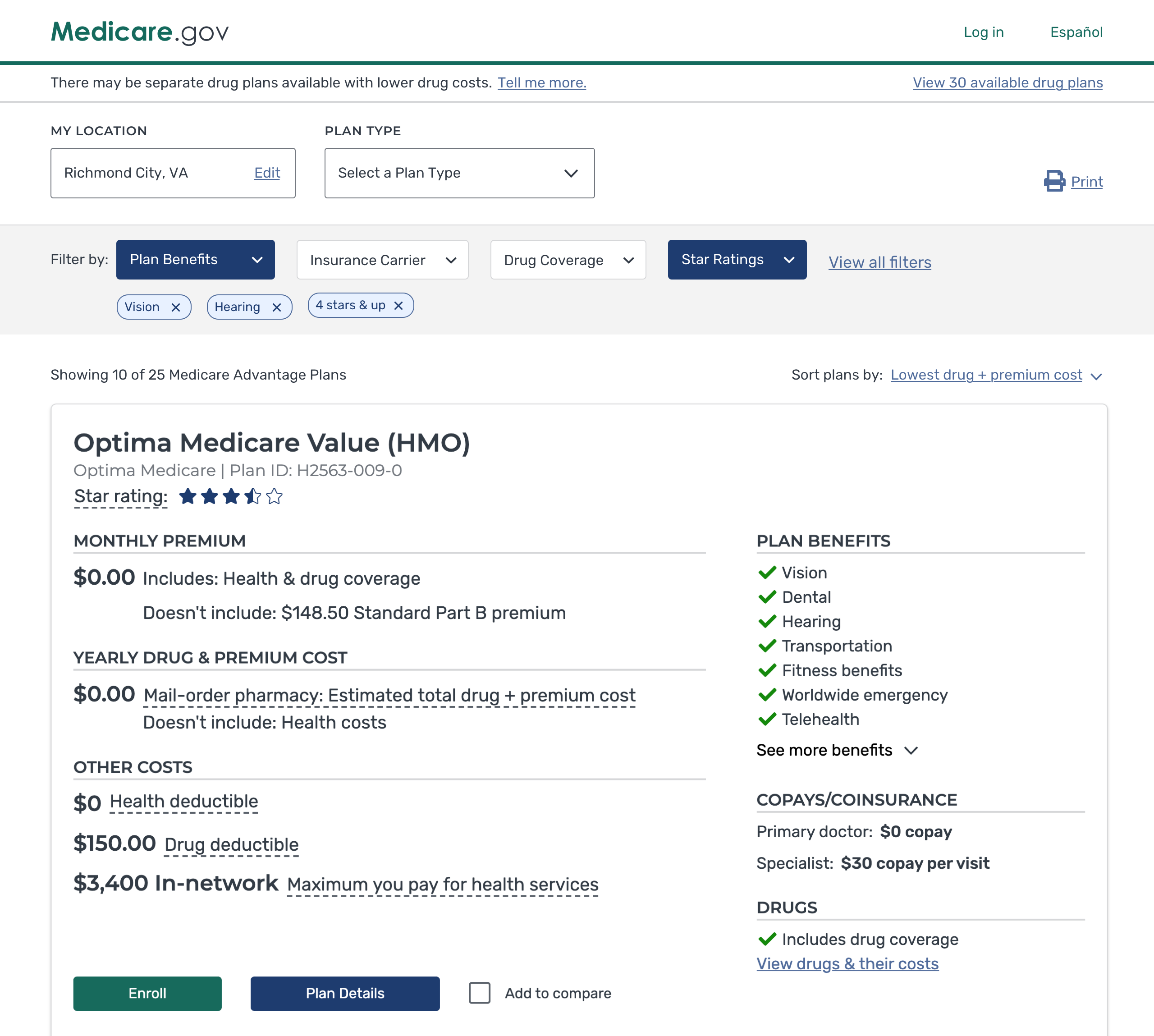
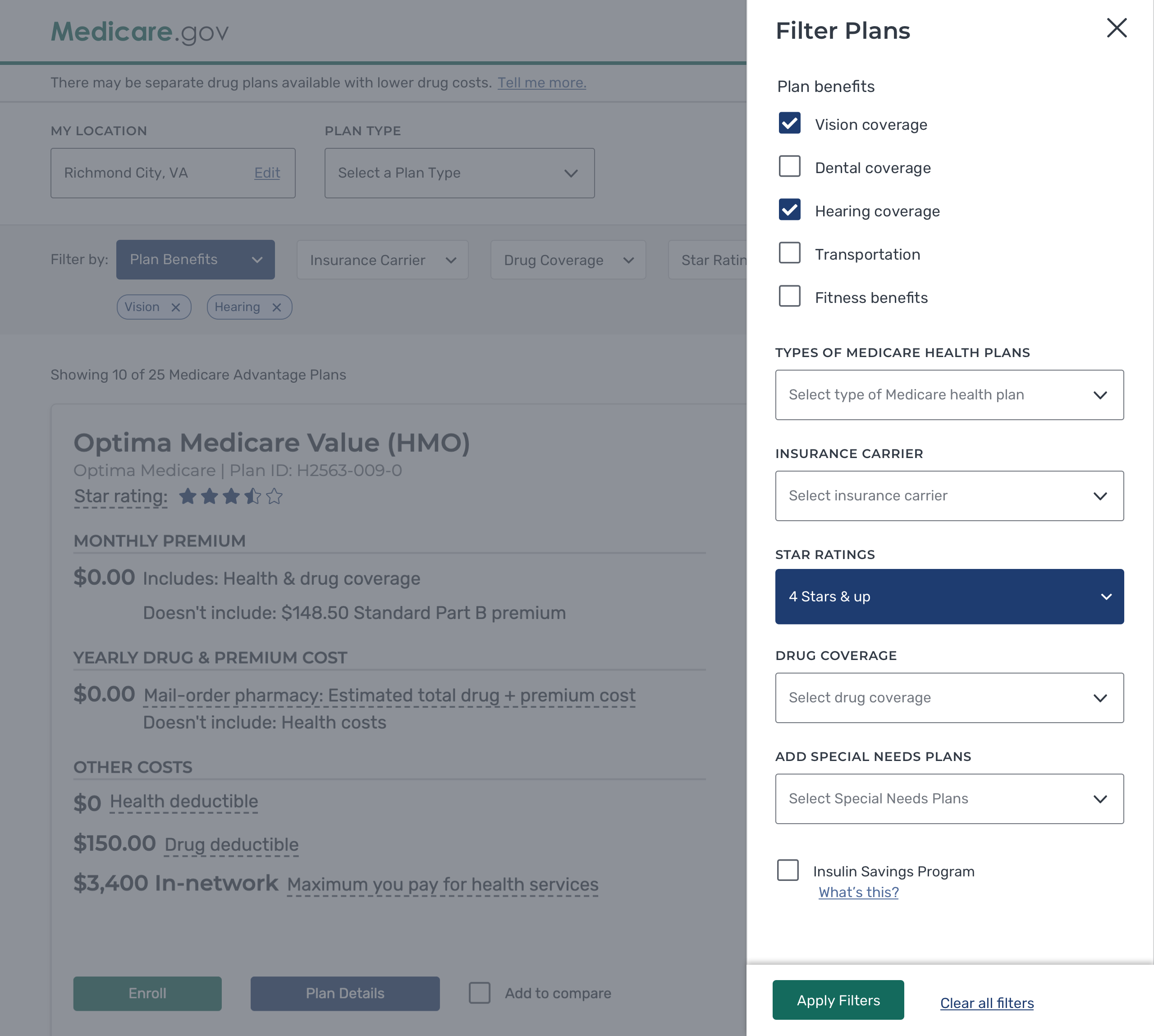
Plan Results redesign
The legacy app's plan results designs were honestly a low bar to improve upon. Utilizing our design system, we were able to leverage modern design patterns quickly to solve problems.
Key design points of the plan results page
- Provide users with a simpler and clearer presentation of the data using improved hierarchy of typography, white space, and grouping of data.
- Provide users with sufficient info, at this point in their search, so as not to overwhelm them yet display relevant info for their healthcare search.
- An accessible and usable mobile experience.
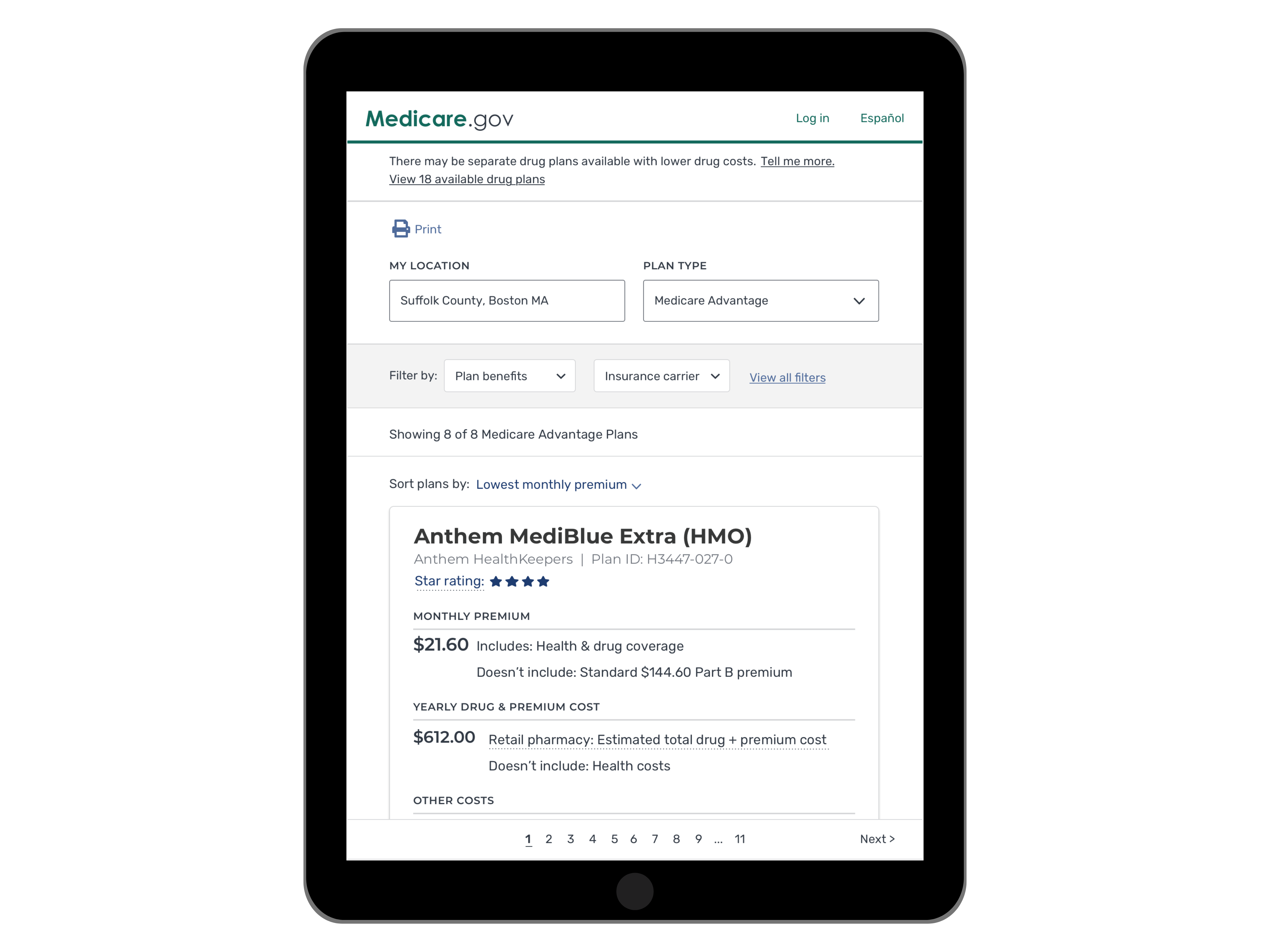
The redesigned Plan Results on mobile experience
Engagement and customer happiness
Since CMS launched the redesigned Medicare Plan Finder, the tool:
- Has helped more than 2.6 million Medicare beneficiaries enroll in a Medicare plan, about 40% more enrollments than the legacy tool the previous year
- Saw an average of 373,000 visitors a day during the next Medicare Open Enrollment.
- Zero downtime for the redesigned Medicare Plan Finder, meaning the tool ran smoothly and did not impact an individual’s ability to find and enroll in Medicare.
Most importantly, we were getting positive feedback from our users:
“Even I, a 73-year-old guy who’s not very computer savvy can figure it out.”
“I really like it because it’s self-explanatory and gives things in detail. You know up front what each plan costs a month, what your deductibles are, and what drugs are covered and what drugs aren’t. That’s really important."