Providing a path forward for the formerly incarcerated
My role
- UX/UI Design
The Challenge
Reducing recidivism is a complex and varied problem. Without a community support system, achieving that goal of staying free is much more daunting.
(Company name redacted) was tasked to build a web app that would allow inmates to search and sign up for community services — providing a conduit between the inmates and services within the community such as education, food banks, social workers, etc. Lastly, the prison staff and case workers need to have oversight of where those who are incarcerated may be at a certain time and which of these community offerings they are involved in.
Our core features of focus
- A simple and accessible search experience for inmates to find community services.
- A platform for the community organizations to display their offered services
- Staff oversight of the activities and communications of inmates.
The Work
- Our small cross-functional team collaborated with the client plus former inmates to better understand the needs and requirements.
- I mapped needs and pain points of various user types to understand how those users related to each other.
- We identified data constraints and technical requirements such as data updates and wifi access within the prison system and how those variables affected the UX.
- We created mockups and clickable prototypes
- We iterated based on more client and inmate feedback
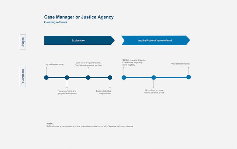
An early draft of a user flow to help think through how people who are incarcerated may use the tool. Note that there were several user types to be accounted for and shown here is just one.
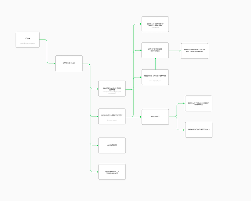
An early mapping of one level of admin's proposed access within the tool.
Component-based Design
A key focus of the UI design was to use modular and responsive components and patterns to create cohesive, consistent experiences. This would also have the benefit of speeding up our team’s workflow and delivery. Think of Brad Frost's "Atomic Design" principles for this.
Using Figma we built out a system of components that accounted for the dynamic nature of content, use cases, and system access. Below shows this type of thinking where our card component needed to be flexible depending on a few different views and use cases. Using slighly different card layouts and responsive behavior we achieved a flexible solution.
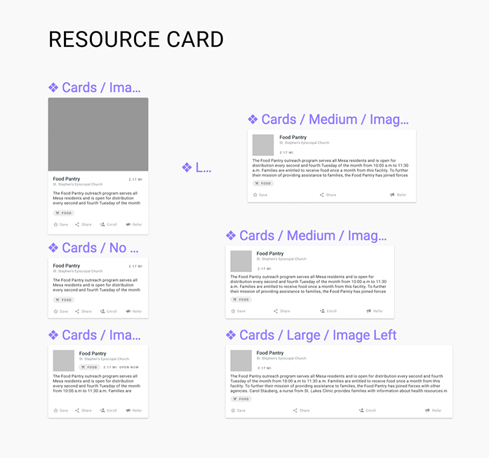
Flexible and responsive components designed in Figma to allow for different use cases and data.
Accessibility and Performance
Another critical point was the need for the design to be accessible, flexible, and performant. Many who are incarcerated would be accessing the app on devices with less than optimal operating systems and internet access. So the app must
- accommodate for the constraints that these phones and tablets provided by making lightweight and responsive designs. Usability over visual beauty.
- be cognitively intuitive to use even for less tech-savvy individuals
- be designed with low-vision users in mind
We solved for the last two bullet points by things like: proper form design, include a label with icons, use plain language, etc.
The Outcome
While I can't show the final app for NDA reasons, below are early prototypes I designed during our ideation phase.
An early mockup, on desktop, showing program offerings for someone who is incarcerated.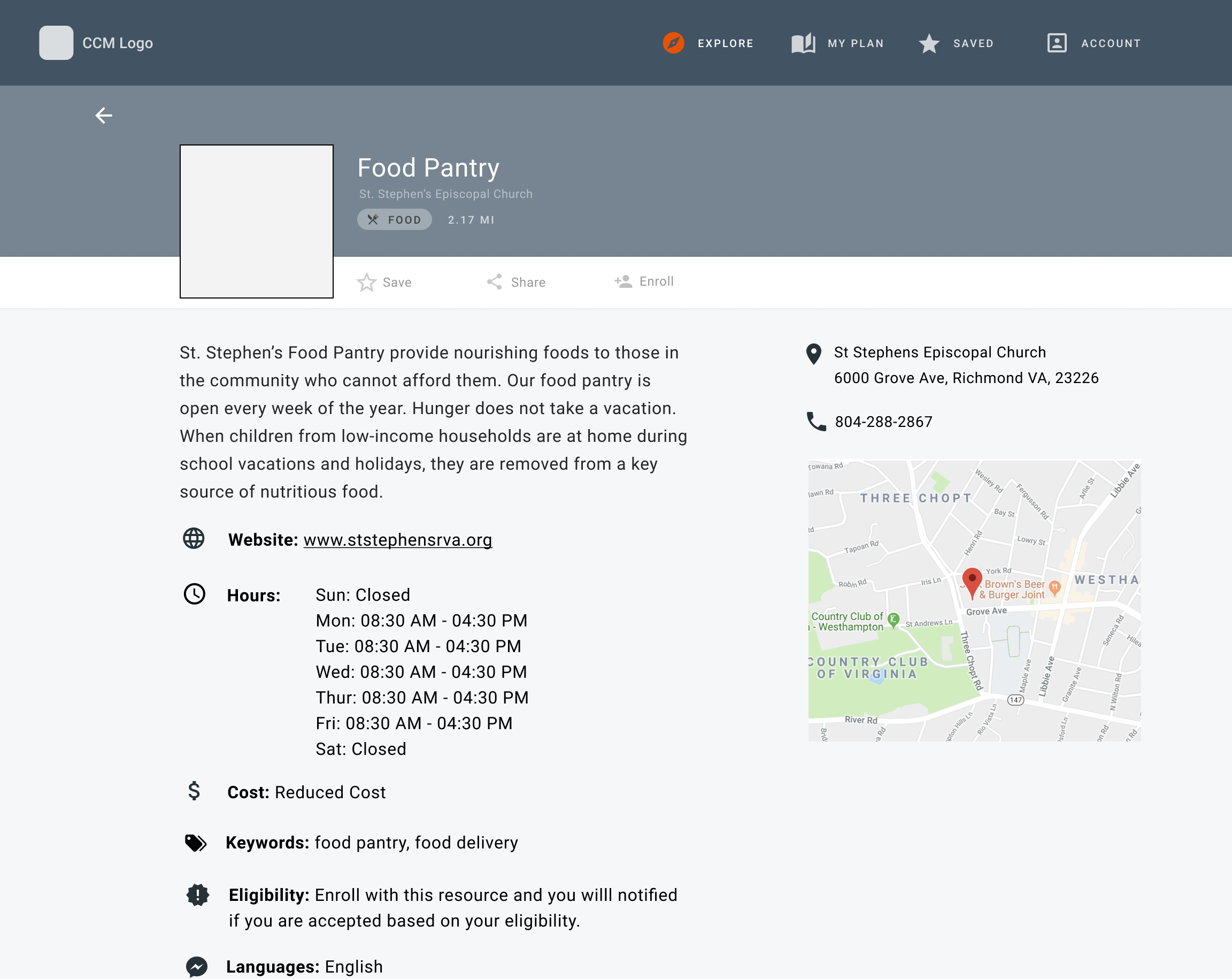
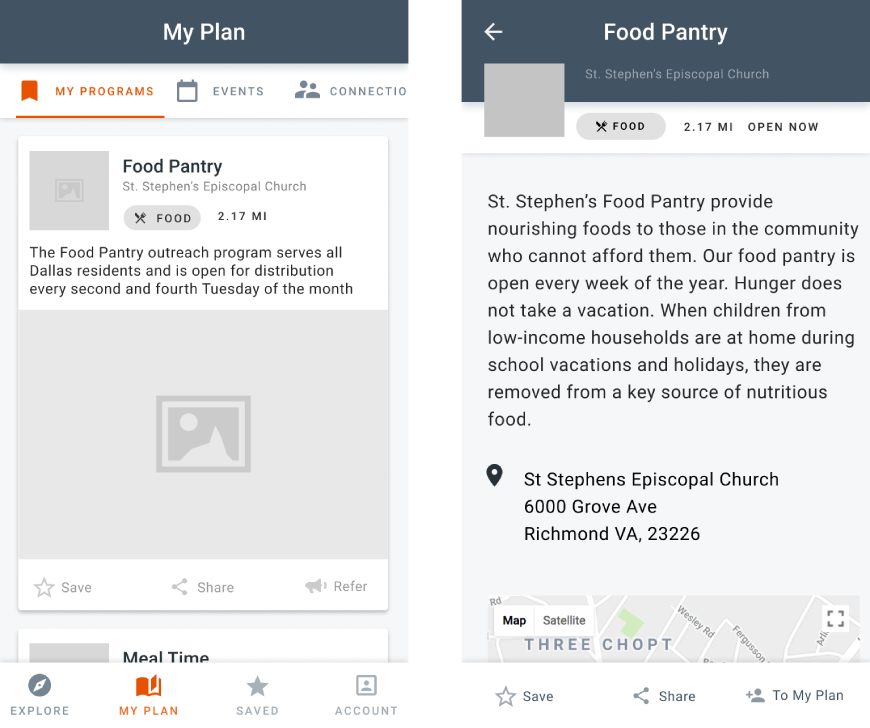
An early mobile mockup showing program offerings (on the left) for someone who is incarcerated and a community program's listing (on the right).
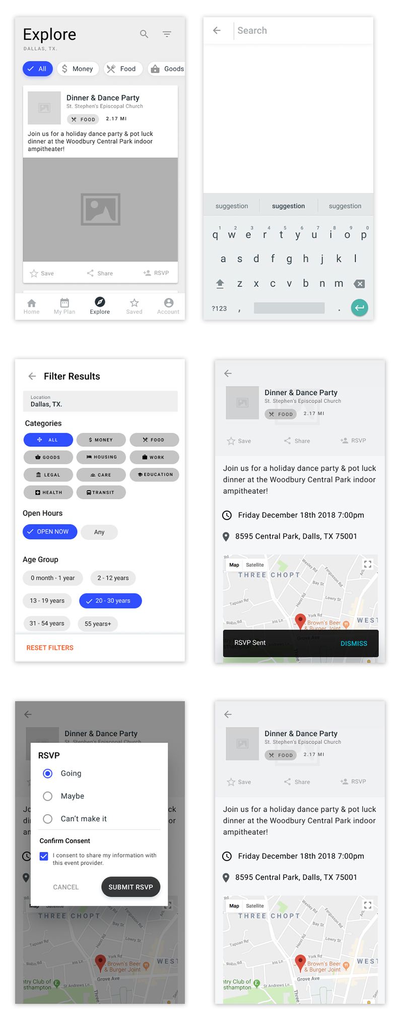
Various states of a user looking for, filtering, and signing up for a program.
By providing open access to community offerings, we were able to allow the incarcerated and formerly incarcerated the highest chances of success.
Data to monitor
To measure success the teams must monitor:
- Task Success: the number of inmates signing up for services through the app
- Engagement and happiness: provide surveys and conduct interviews with inmates, prison staff, and community organizations to understand positive and negative points of the app.